Insights
Why the Colour Palette of Your Custom Corporate Gift Bag Should Match the Occasion Rather Than Your Brand Guidelines
Procurement teams default to brand colours for corporate gift bags, but the colour palette operates as an emotional register that should match the gifting occasion rather than the brand guidelines.
Published · By KiwiBag Works Team
When a procurement team specifies the colour palette for a corporate gift bag order, the default instruction is almost always a variation of “use our brand colours.” The reasoning is straightforward: the gift bag is a branded touchpoint, and branded touchpoints should reinforce visual identity. This logic is correct for trade show collateral, retail packaging, and promotional merchandise—contexts where the bag functions as a marketing vehicle and brand recognition is the primary objective. It is not correct for corporate gifting, where the bag functions as a relationship gesture and the primary objective is communicating consideration, not identity. The colour of a corporate gift bag operates as an emotional register—it signals the tone of the occasion before the recipient processes the logo, the material, or the contents. A procurement specification that defaults to brand colours without evaluating whether those colours match the emotional context of the gifting occasion produces bags that look like marketing materials delivered in a gifting format.
The misjudgment is rooted in how colour decisions are structured within most organisations. Brand colour palettes are defined by marketing teams, codified in brand guidelines, and enforced across all external-facing materials. When procurement receives a brief for corporate gift bags, the brand guidelines are the first reference document consulted—and often the only one. The guidelines specify exact Pantone references, acceptable colour combinations, and minimum contrast ratios for logo visibility. These specifications are designed to ensure consistency across advertising, packaging, and digital media. They are not designed to account for the emotional dynamics of gift-giving, where the colour of the container sets an expectation about the nature of the gesture before the gift is revealed. A technology company whose brand palette centres on electric blue and bright green has colours optimised for screen visibility and trade show standout. Those same colours, applied to a custom cotton tote bag intended as a client appreciation gift, produce a bag that reads as conference swag rather than a considered gesture. The colour is technically correct—it matches the brand guidelines—but it is emotionally misaligned with the occasion.
The distinction between brand-appropriate and occasion-appropriate colour is not intuitive to procurement teams because the two frameworks rarely conflict in other purchasing contexts. When ordering branded stationery, branded apparel, or branded office supplies, using brand colours is both functionally and emotionally appropriate—the items exist within a professional context where brand reinforcement is welcome. Corporate gifts occupy a different psychological space. They are received as personal gestures, even when they originate from an organisation. The recipient’s emotional processing of a gift follows the same pattern regardless of whether the gift comes from an individual or a company: the external presentation creates an expectation, the unwrapping confirms or contradicts that expectation, and the gift itself is evaluated against the frame that the presentation established. A bag in muted charcoal with a subtle tone-on-tone logo creates an expectation of understated thoughtfulness. A bag in the company’s full-saturation brand orange creates an expectation of promotional content. The gift inside may be identical, but the recipient’s evaluation of that gift is pre-shaped by the colour signal the bag transmitted.
In the New Zealand business environment, this colour misalignment carries particular weight because the local corporate culture places high value on authenticity and restraint. New Zealand business relationships tend to favour genuine connection over performative generosity, and a corporate gift that looks overtly branded can feel transactional rather than relational. A client receiving a gift bag in the sender’s full brand livery may interpret the gesture as marketing rather than appreciation—not because the intent was insincere, but because the visual presentation triggered a marketing-recognition response rather than a gift-receiving response. This is especially pronounced in sectors where procurement teams interact with government agencies, iwi organisations, or community-facing businesses, where the cultural expectation is that gifts should demonstrate respect for the relationship rather than leverage it for brand exposure. A bag in natural linen tones with a discreet embossed logo communicates “we value this relationship.” A bag in corporate red with a large printed logo communicates “we want you to remember our brand.” Both messages are legitimate, but they serve different purposes, and conflating them is where the judgment error occurs.
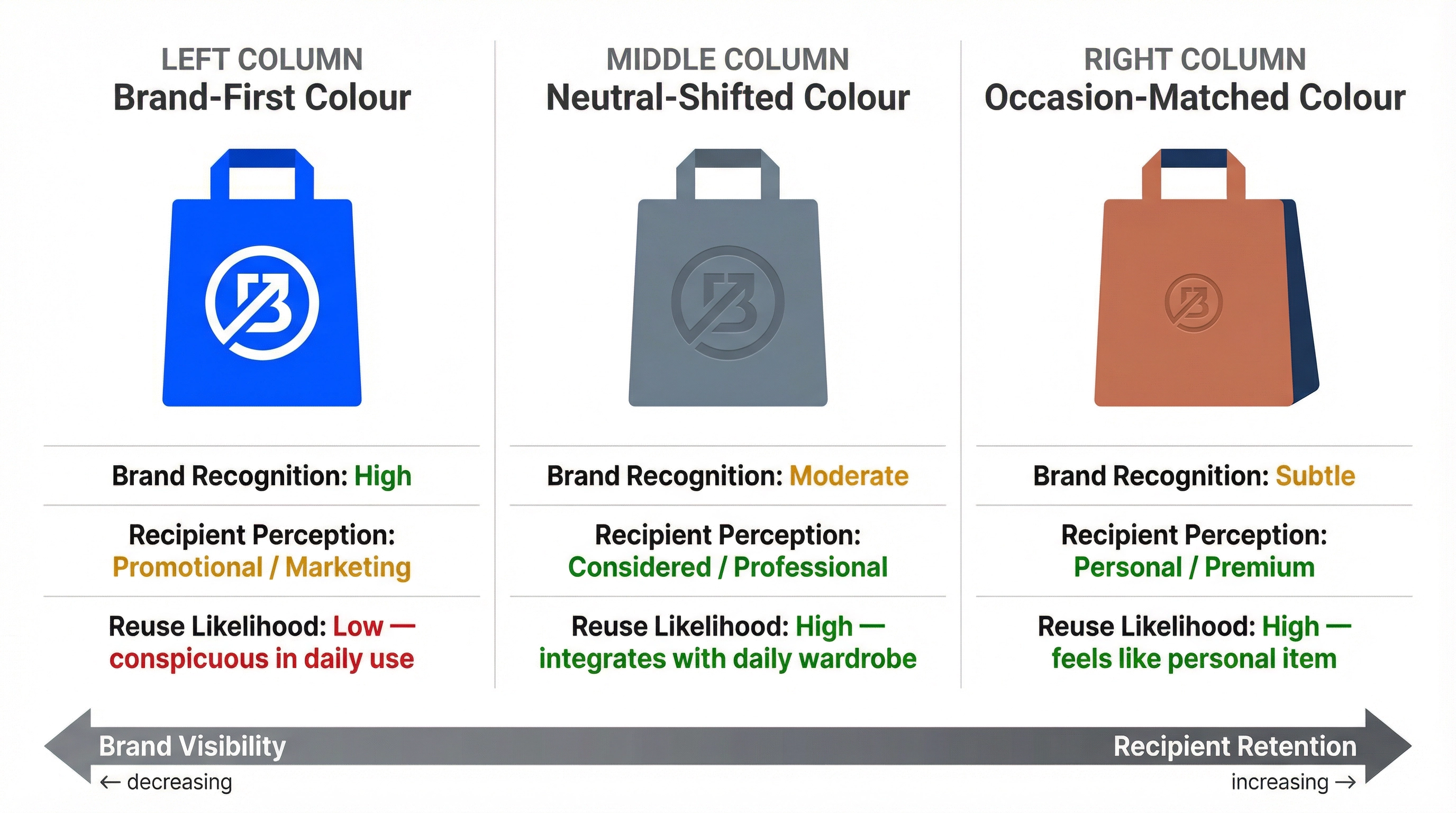
The colour palette also interacts with the recipient’s likely reuse of the bag, which is the dimension where corporate gift bags generate their longest-lasting brand impressions—and the dimension most completely absent from colour specifications. A custom tote bag in a neutral palette—navy, olive, charcoal, natural canvas—integrates into the recipient’s daily routine because it coordinates with most clothing and most contexts. A bag in a distinctive brand colour—magenta, electric blue, lime green—is visually conspicuous in everyday use, which is precisely what makes it effective as promotional merchandise and precisely what makes it ineffective as a gift bag. Recipients who feel self-conscious carrying a brightly branded bag in public will not carry it, and a bag that is not carried generates no impressions regardless of how well the logo was printed. The paradox is that the colour palette designed to maximise brand visibility actually minimises it, because it reduces the bag’s reuse rate to near zero outside of professional contexts where branded items are expected.
The seasonal timing of corporate gifting programmes in New Zealand introduces colour considerations that brand guidelines do not address. End-of-year gifts distributed in November and December arrive during the New Zealand summer, when recipients are in a lighter, more relaxed frame of mind. Warm earth tones, soft greens, and natural canvas colours align with the seasonal mood and the outdoor-oriented lifestyle that characterises New Zealand summer. Mid-year gifts distributed in June and July coincide with winter, when darker, richer tones—deep navy, burgundy, forest green—feel more appropriate and more premium. A procurement team that orders the same brand-coloured bags for both distribution periods misses the opportunity to calibrate the emotional register of the gift to the season in which it will be received. This is not about following fashion trends. It is about recognising that the same colour communicates differently depending on when and where it is encountered, and that a gift bag’s colour should serve the moment of giving rather than the permanence of brand identity.
The practical consequence of defaulting to brand colours becomes most visible when a single corporate gifting programme serves multiple relationship tiers. A company might distribute custom bags to three audiences: premium clients receiving high-value gifts, business partners receiving mid-tier gifts, and event attendees receiving standard gifts. The instinct is to use the same bag design across all three tiers, varying only the contents and perhaps the bag size. This approach is efficient from a production standpoint—a single bag specification, a single print setup, a single quality control standard. But it means the premium client receives a gift in the same visual packaging as the event attendee, which undermines the differentiation that the gift programme was designed to create. Colour is the most cost-effective way to create tier differentiation without redesigning the bag. A premium client bag in deep charcoal with a debossed logo, a partner bag in the brand’s secondary colour at reduced saturation, and an event bag in the full brand palette creates three distinct emotional registers from a single bag silhouette. The production cost difference is minimal—colour changes between print runs are standard factory operations—but the perceptual difference to the recipient is substantial.
The compliance dimension of colour selection is one that procurement teams in New Zealand encounter more frequently than they anticipate, particularly when gifting across cultural contexts within the domestic market. Certain colours carry specific cultural associations that can enhance or undermine the gift’s reception depending on the recipient’s background. In Māori cultural contexts, red and black carry significance related to status and authority, and their use on a gift bag may be interpreted as either respectful or presumptuous depending on the relationship and the occasion. In Pacific Island business communities, certain colour combinations are associated with specific island nations, and inadvertently replicating those combinations on a corporate gift bag can create unintended associations. These are not obscure edge cases in New Zealand’s multicultural business environment—they are routine considerations that a colour specification based solely on brand guidelines will not capture. A procurement team that consults with the relationship manager or the recipient’s cultural context before finalising the colour specification avoids these risks. A team that defaults to brand colours does not.
The factory perspective on colour specification reveals why the brand-colour default persists even when it is suboptimal. When a factory receives an order for custom corporate gift bags with a colour specification that references a Pantone number from the client’s brand guidelines, the production process is straightforward: match the Pantone, print the logo, ship the bags. When a factory receives an order with a colour specification that says “muted version of our brand colour, appropriate for executive gifting,” the production process requires interpretation—and factories prefer specifications that eliminate interpretation. The result is that procurement teams who want occasion-appropriate colours must do the interpretive work themselves, specifying exact Pantone references for the occasion palette rather than referencing brand guidelines. This requires a conversation between procurement, marketing, and the relationship management team that rarely happens because the brand guidelines appear to have already answered the colour question. The guidelines did answer it—but they answered it for marketing contexts, not gifting contexts, and the two answers are different.
For teams navigating how different corporate gift types serve different business relationships, the colour specification deserves to be treated as an emotional calibration decision rather than a brand compliance exercise. The colour is not decoration applied to the bag’s surface. It is the first emotional signal the recipient receives, and it establishes the interpretive frame for everything that follows—the material’s hand feel, the logo’s placement, the gift’s perceived value, and the relationship’s perceived sincerity. A specification that reads “Pantone 7545 C (muted slate), tone-on-tone debossed logo” takes the same production effort as one that reads “Pantone 2728 C (brand blue), white screen-printed logo,” but the first produces a gift bag and the second produces a branded bag. The distinction is not semantic. It is the distinction between a gesture that enters the recipient’s personal space and one that remains in their professional space, and that distinction determines whether the gift achieves its relational objective or merely its branding objective.
The pattern that produces the strongest outcomes in corporate gifting programmes is not the elimination of brand colour but its strategic modulation. The brand identity remains present—through logo placement, material quality, and structural design—but the colour palette shifts from brand-first to occasion-first. A company with a vibrant orange brand palette might use a warm terracotta for client appreciation bags, retaining the colour family while reducing the saturation to a level that reads as considered rather than promotional. A company with a corporate blue palette might shift to a deeper navy for executive gifts, maintaining the blue association while moving the emotional register from professional to premium. These modulations preserve brand recognition while respecting the emotional dynamics of gift-giving, and they require nothing more than specifying a different Pantone reference on the production order. The cost is identical. The production complexity is identical. The recipient experience is fundamentally different, because the colour told them this was a gift before they ever saw the logo.